Make the important
thing unmistakable.
Neutral letterforms, close headline spacing, comfortable reading measure. Hierarchy comes from proportion.
The records can change their language.
The identity holds the collection together.
Lowercase, closely set, and deliberately unshowy. The registered mark sits high and apart. This is the same shared lockup used in the header and footer.
The archive is the quiet environment around the work. Colour earns attention by arriving in small amounts.
The room everything lives in.
Words, structure and the essential details.
A small interruption. Use sparingly.
A second layer, quietly separated.
Vermilion is an accent, not a body-text colour. Use olive ink on paper for reading and controls.
Neutral letterforms, close headline spacing, comfortable reading measure. Hierarchy comes from proportion.
A human counterpoint for a considered phrase. Keep it occasional, so it keeps its voice.
The small-print system: catalogue numbers, captions, dates and the details that reward attention.
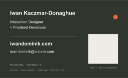
A two-sided business card drawn from the archive. Paper on the front, olive ink on the back, and a direct route to the work.
90 × 55 mm
Two sides · 3 mm bleed
Name, practice, email and website.
QR code links directly to iwandominik.com.
Two-page vector PDF with trim marks.
Embedded fonts and defined trim/bleed boxes.
Set up for 100% scale. Ask your printer to use the PDF trim box; the surrounding marks and bleed are not part of the finished card. Colour conversion and stock choice belong in the printer’s proof.
Keep controls recognisable. Let motion explain a change. Leave enough room for the work to be the interesting thing.